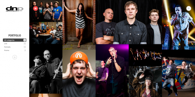
Hooray, a new website!


This is something I’ve been itching to get done for a while, and is sorely needed. A new blog and more importantly, a new portfolio display. After a good long while debating and planning, I’ve finally got this place set up in a way that I’m happy with.

The previous site configuration was a hybrid that I’d thrown together to fit what I had a concept of. I wrote about it a bit previously. I wanted something that presented the images in a flexible manner, showing gorgeous images for any platform, whether it’s desktop, phone, or tablet. I also wanted something that clearly delineated exactly what I shoot, and make it easy for people to view those categories.
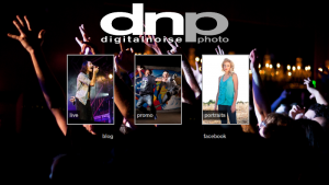
The landing page that I had previously come up with did that pretty well, I believe. It was a responsive design that looked good on phones and large displays, and the same went for the different portfolio sections. These were powered by a Lightroom export plugin that created these nice touch-friendly galleries. From there, going to the blog then entered into the actual blog structure.
This was nice because I could update the portfolio sections individually by exporting various collections in Lightroom, and it looked really good for all devices. The downside is that the landing page looked totally different from the blog/site, and more than that, they weren’t integrated at all. Entirely different mechanisms. Not as simple as it could be, in my book.
As far as SEO goes, this was a hodgepodge of bad results. There was SEO for the portfolio, and then separate SEO for the blog. Unfortunately, the portfolio usually got skipped entirely in search results, and brought people to a page on the blog. This definitely wasn’t the best way for things to be handled, as the first views someone would see was just a blog page, and not a good representation of my work.
On top of that, the theme (DeepFocus) that I have been using for the actual site and blog had been giving me issues, and definitely was not doing it for me, visually. Not to mention the fact that the version I have installed is not responsive or liquid in design. All in all, it needed to be replaced, as it had become frustrating, and I didn’t even want it to be shown off anymore. Because of that, I stopped updating the blog, and that definitely means it’s in need of a change.
When I decided that I would start looking around for a new theme and structure, I had a few things that I did and didn’t want in the theme in order to fit my concept:
- I didn’t want the typical slider home page. As opposed to loading one big slideshow, I wanted an immediate view of my portfolio as a whole, not being fed one after another. In my opinion, it’s not as easy to see an overview of work with a big, full-screen slider.
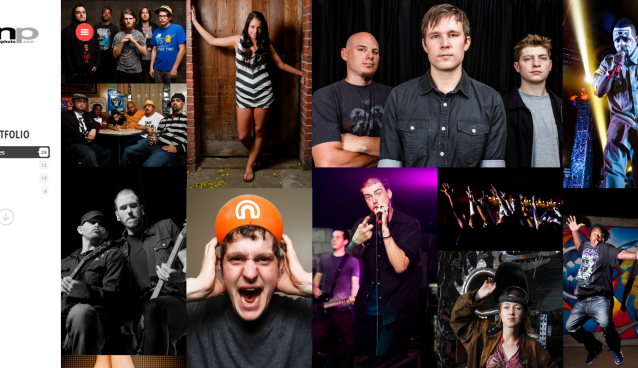
- A mosaic was what I had in mind. But most themes put emphasis on having a thumbnail then open up multiple images (a “portfolio” in WP-speak, basically), and that isn’t what I wanted.
- I wanted the mosaic of images to look modern, clean, and flat. When the viewer clicks on the image, I don’t want it to load another page. The image should load in a clean lightbox display. Preferably keyboard-navigable throughout the portfolio.
- I wanted the portfolio mosaic to be sortable into categories, hopefully via fancy ajax niceness.
- The blog portion had to be flexible, and easy to read. The options of a classic blog style and a mosaic (or “masonry” style) is nice.
- I didn’t want the large background image. It’s a distraction from whatever image you’re actually trying to show in a blog post or featured image, as well as making text difficult to read. It also contributes to slower loading times.
- It had to not only be responsive and/or liquid in design, but also perform well on mobile platforms.
- SEO on the previous configuration was abysmal, the new theme had to take this into consideration.
After narrowing it from hundreds of viewed premium themes that fit my concept at least in a vague way, I found three themes that I was deciding on. After testing those three side by side on desktop, mobile, and tablet, I ended up deciding on what you see here. My only niggle with this theme (and pretty much any WordPress creative theme) is that setting up the portfolio isn’t as easy as one would hope.
In my situation, I have three porftolio categories, and my images all fall within those three. I would have loved to have been able to provide the theme with all of the images in one step, and then have the theme assemble the portfolio that way. Unfortunately, pretty much all WordPress themes with a “portfolio” view do not treat portfolios as such. The “portfolio” view is really just a collection of “portfolio posts”, looks like maybe a custom post type (not sure on that). Each one of these posts are intended to have a bunch of photos in the post, which is that specific “portfolio”.
The general concept here is that photographers are generalists, or show job-based portfolios. Something like a generalist photographer who shoots “flowers”, and then “people”, and then “landscapes”, and then “fine art”. Or a commercial photographer has “portraits”, “macro”, “Nike”, “REI”, or whatever. Basically, a situation where a photographer has lots of projects that they treat as their main portfolio, especially people who are constantly adding to this portfolio of portfolios.
That’s not me, unfortunately. While I do shoot more than just live, portraits, and promo work, that’s not what I want to show as my portfolio. I’ll make a blog post, sure. But I won’t show it as a portfolio piece because it’s not the sort of jobs l want to attract. That said, I just want to display my three areas of work all together, without having to drill down unless it’s an optional process.
I may be too picky here about what exactly I have in mind, and how it all functions. And on top of the functionality, it has to look good, in a way that fits me as a person and photographer. I think that with this setup I finally have that. The theme I’m using, by the way, is called Sniper. The other two that I was debating at the end of the process were Iris and Titan. Those are affiliate links, btw. These guys make some really great stuff.
So that’s the rundown on what brought me to where I’m at now with this site. I still have some tweaking to do within the various options, but it’s 99% set. I also feel like it’s time for a new logo, but that’s an eventuality. One of these days I’ll either design a new one, or pay for one to be designed by someone much better than myself. But like I said, that’s for later days.
Have any questions? Comments or feedback? Leave it in the comments below, and if you made it this far, thanks for sticking around through my rambling thought process.
