Misamore Promo, and Delivering Options To Your Clients

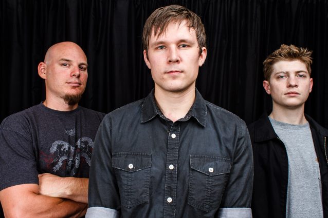
In June, my buddy Josh Amolsch of the band Misamore hired me to do a super-quick band portrait session. We busted it out pretty fast, and got him the image he wanted. I really like it, I think it works for the band quite nicely. There’s things that I wish I could’ve done instead, like have a bit more space in the room to shoot longer lenses and have a flat black background, but all in all, with the time constraints we had it came out great.
We shot 38 photos (including some tests), and after culling through those, I sent 14 images over for their perusal. The band ended up choosing two, both horizontal, with the second being very similar to the one above, but the guys were grouped together a bit more closely, and the image above won out as the better photo (at least in my opinion).
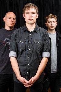
Since we had very limited space, and the backdrop wasn’t a seamless sweep, I didn’t really focus on verticals. But I still made sure to shoot one at the very end, just in case. It wasn’t selected by the band, and I’m guessing that the reason was because you can see the hardwood floor at the bottom of the image. Not an absolute dealbreaker, but a dealbreaker nonetheless, I suppose.
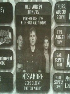
So here we are at the end of the shoot, the band’s happy, I’m happy, and the photo has been put out there on le internets for their promo use. So when it comes time for people to start promoting the band and shows, naturally they’re going to find an image and use it for the promotional materials. Such is the case with Submerge Magazine, using the chosen photo for an ad in the magazine for their show coming up today out at Powerhouse Pub in Folsom.
Hey, cool! Always glad to see my stuff be chosen over others for things like this. However, there’s one issue… Anyone who has tried to watch DVDs or online video with me knows that I’m a serious nerd about aspect ratio, and things looking squished. I most definitely noticed that this image has the guys compressed horizontally in order to fit into the boundaries of the ad posting. I’m sure no one else cares about this, but it’s just something that irks me. Just a little bit.
So that’s where we come to the second half of the title of this post. Always shoot more than what you think you need (or what the client thinks they need). They only care about horizontals? Shoot a few verticals once you’ve got the safe, desired shots in the can. They want to fill the frame up with their bodies? Try to shoot some with negative space to give room for magazine or flyer info copy (hey, you never know, right?). Had I had more headroom, I would’ve done exactly those two combined. Vertical with a bunch of negative space up at the top for flyer info. Alas, the backdrop ended JUST out of frame on these photos, which is where the ceiling began. But like I said before, made the best out of a limited situation.
But as you can probably tell, had the magazine had the option to run a vertical in that space, they might have, and it wouldn’t have been squished. It’s not that big of a deal for an ad for a show in a local magazine, but if you’re shooting for a bigger client, or for a magazine specifically with an article in mind, you will run into these issues. So once your “safe” shots are nailed down, make sure you get them some variety. Go the extra mile if it’s possible. They may not choose them, but you may like the results, or they may be usable for something else for the client at a later time.
Misamore is playing at Powerhouse Pub in Folsom, CA tonight at 8:00pm, along with Zeroclient and Twitch Angry. Show is $5, and is 21+.


2 thoughts on “Misamore Promo, and Delivering Options To Your Clients”