Image, Style, and a Return to Blogging, Part 1

Hey there strangers, looks like I’ve neglected my poor blog here, and haven’t posted for a while. Silly Facebook, Google+, etc becoming the destinations for everyone’s attention. Not too many people blog anymore other than the big guys, and those addicted to long-form content publishing. But I really would like to get back to posting blogs, and I’ll do my best to stick to it. Although with my luck, this will be the last blog post until the next “Whoa, where have I been?” post. Hah.
This blog post will be divided into a couple parts, which all tie in together. Actually, this turned out to be pretty long on the first part, so it’ll be separate blog posts. Onto post number one!
A New Portfolio & A Return to Blogging
Part of the reason why I ignored my blog for so long was because I grew disenchanted with it. I revamped the design, and at first I loved it. That faded after a while. Partially because my old host was slow as dog crap, and there were constant WordPress vulnerabilities that kept wreaking havoc on my blog. The other factor (aside from the ease of just posting to Facebook et al) was my portfolio that was shown when someone would reach my domain name. It looked cool, but, it was just a glut of images, and it didn’t really present my work the way I wanted it to, how I saw it in my mind.
The old “original” portfolio was a step in the right direction, but still not quite what I was looking for. It looked great on monitors of all sizes, it’s not using Flash for iPhone/low-powered Android friendliness, and it had the applicable links to my blog, Facebook, and prints site (which is the next online presence I need to revamp). However, there’s over thirty images just sitting there, and they’re all mixed in with each other. Okay, that’s cool and all, but… 30 images? I doubt most people go through more than 10 if they’re just stumbling through randomly. Not to mention the bandwidth required to load all this stuff on a mobile device? Yeah, definitely not what I was looking for.
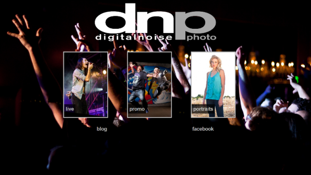
The image at the top of this blog post is what you now see when you visit https://www.digitalnoisestudios.com. It’s built upon a responsive HTML framework that scales nicely depending on the resolution of the display being used. The images on this page are saved as small as possible while still looking clean on a full 1080p display. I had attempted to implement some tech that would also dynamically decide the resolution of the viewing device and automatically scale the images down (actually resizing them on the fly) as to use smaller-sized images on smaller-sized devices, however it absolutely blasted away my blog functionality. Needless to say, it was scrapped.
But the point is, the new portfolio/landing page accomplishes several things at once:
- Prominently displays my brand/logo
- Puts appropriate links to blog and FB right there where they’re easy to find
- Readily highlights the three main areas that I focus on with my photography–live music, band promos, and portraits
- Is extremely mobile friendly throughout the landing page and slideshows
- I think it looks rather sick. 😀
You’ll notice that the three separate portfolio sections are using the same slideshow mechanisms that the older “large” portfolio used. I really like this slideshow, it’s an export plugin for Adobe Lightroom, and makes things pretty simple. Having it split into three separate categories also makes updating it faster. Need to add one new portrait (which I actually have to do)? Just re-export that one collection in LR, without exporting the other images (which still gets close to about 30 images after culling some out).
At this point, the portfolio/landing page is EXACTLY what I had been envisioning for about a year now, functionality-wise. The design and visual aspects of the landing page I had designed on the fly while creating the page. One of those insanely lucky first-build successes. All in all, I think it communicates the right image for me and my photography. It puts my areas of expertise up front in a visually striking manner without excess bloat slowing down the viewing process, no matter what device you’re on.
All of this creates an image of my photographic entity. Usability, smooth design, and of course the photos themselves. So that will bring us to “image” in general, in part two, possibly tomorrow. Stay tuned… which is right here!


5 thoughts on “Image, Style, and a Return to Blogging, Part 1”